Style Guide Basics + Why Your Organization Needs One
A style guide is a document that contains all of the branding standards for your company. It is vital to establish brand standards and stick to them so that your branding is cohesive and matches across every outlet. This will lead to brand recognition with your customers and build trust.
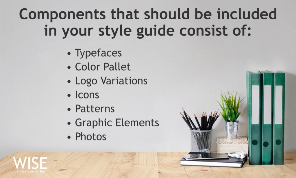
Components that should be included in your style guide consist of typefaces, color pallet, logo variations, icons, patterns, graphic elements, and photos.
Think of your style guide as a set of rules for how your company is visually portrayed.
Whether you are a one person show or if you have a team of 500, having a style guide will help keep your branding consistent. If you have a web design team, a graphic designer, and a social media marketer, they all need this reference tool in order to be on the same page with how they visually portray the company in their work.
Imagine if different fonts and shades of color were used on your website, your product packaging, and your social media pages. This lack of consistency would cause confusion to potential and existing customers because your brand is not easily recognizable.
Coca-Cola, a 127 year old company, has strategically updated their branding over the years and managed to be universally recognizable because of their consistency. Without a set of branding guidelines to follow, this would not be possible.
If your company doesn’t have a style guide, creating one will be well worth your time in the long run. Working with a graphic designer to create a well thought out style guide is a valuable investment.
At WISE we work with a lot of small businesses and offer style guide development services. If there is no space in your budget, take the time to write out the basics yourself.
What to include in a Style Guide:
Include all versions of your logo and any rules you have for how your logo is displayed. For instance, never place the logo on a patterned background.
Next, include your color pallet; a great tool to help with this is color.adobe.com/. The colors you establish say a lot about your brand. Imagine a company whose target market is mom’s with girls between the ages of 3-6 who take ballet, but their branding colors are dark greens and browns, this doesn’t make sense. It’s important to stand out against your competitors but make sure you aren’t so different from your industry that it confuses your customers.
Finally, include the your brands typefaces and the weights that correspond with each (light, regular, bold). Specify the applications for each typeface so that it is clear which should be used for headers and which are suited for body text.
By having a style guide, you are able to ensure that your company looks uniform used across the board. This in turn creates trust with potential customers because the consistency enables them to recognize your brand everywhere they see it.
Is your branding ready for a re-fresh? Then take the quiz to see if you are a branding maven or in need of a rebrand.

Erin Robinett
Erin studied Graphic Design at Salisbury University. She has worked in the industry for 7 years, with experience in branding, package design, and typography. As a wife to an Army Sapper, she enjoys traveling, going to the beach, and painting.